


There’s nothing like a fresh coat of paint to brighten up your home, and chase your blues away on a cold, winter day! If you’re ready for new color on your walls and in your life, we would like to help steer you in the right direction.
Access Design + Build can create a color palate that accentuates your style now, while accommodating your needs in the future. Could you use a color that will help calm you down, while still expressing your personality? Do you need to surround yourself with energy? Do you have vision issues that could worsen over time? These are the kinds of questions our decorators ask during paint consultations, along with recognizing what will match your furnishings. Paint stores have color specialists and palates to choose from. We can work with them too! Just remember that when colors are trending, it doesn’t mean they’re right for you and your home.
Color speaks to people in different ways, and the key to picking the right colors for your home
is assessing your comfort level. If boundaries make you feel safer and secure, choose contrast from room to room. If you like color to flow from one room to another, choose more of one paint color for your home, and add pops of color in other ways, like this:
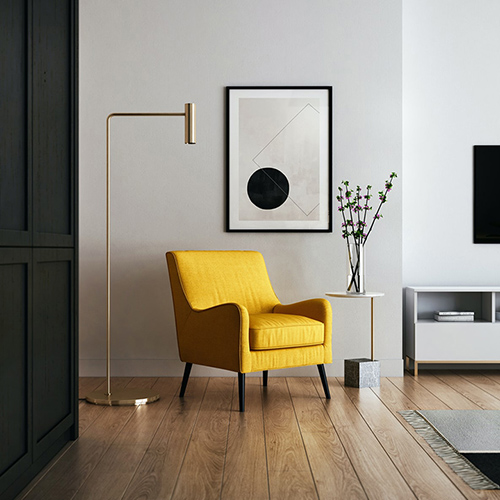
- Find a fun chair in an antique store, paint it a fun color, and put it in your entry way, or paint some bar stools and put a colorful fabric on them.
- Paint your kitchen island or vanity cabinets a color that brings you joy. Before you paint, make sure they’re made of wood, and not a form of plastic, or the paint won’t stick.
- If your spouse has vision problems, you can paint accessories a different color than the wall to make them stand out, like a coat rack or table.
Here’s the rundown on colors:
Red: Energy color —good for stimulating appetite in a dining room and exercise in an exercise room
Orange: Mentally stimulating — good for a home office
Yellow: Sunshine and warmth — brightens up basements, back hallways, and kitchens
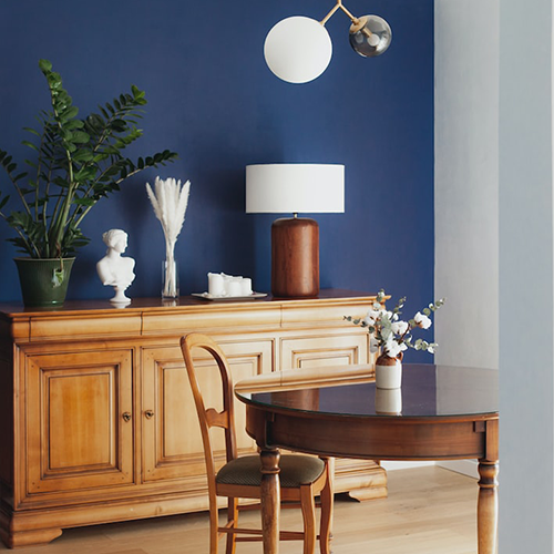
Blue: Calming, but can be cold — use to create calm in bathrooms, bedrooms, and living rooms
Green: Calm and nurture — when you match it with brown, it creates comfort because they are nature/nurture colors — good in living rooms, family rooms and kitchens
Purple: Mystery, creativity, and elegance — good for office or study area — sensory-friendly with any shade of green — good together in nurseries and sensory rooms because they’re not excitable colors
Beiges: White to cream to brown to gray to black — neutral colors that bring balance and contrast — if you love wall art, their neutrality is a desirable background for it.
What’s the most popular color? Minnesotans love blue, and so does the rest of America. Hands down, it’s the most popular wall color, although the name reflects the very thing you’re striving to combat in a cold Minnesota winter. But don’t worry, if the color makes you happy, you’re good to go!
Happy Holidays to you and your family! May the colors of the season bring you joy and inspire you to bring new colors into your home in the colder winter months ahead.